


The following is a redacted, lightly embellished interview with Adriana Quezada, transcribed from a Zoom call with the staff at Atticus Review. Adriana is creating a series of gorgeous images for Atticus Review’s second season of NFTs. So far, she has completed two sets of NFT illustrations: for The Breadwinner (2.1) and for The Deep Field (2.2). Her illustrations are engaging, vivid, and original, and we feel very fortunate to have Adriana on our team this year.
We split the interview in two; this week we are sending you the first part. Adriana talks about her background, her influences, and shows us a few examples of the work she’s done for books, magazines, and other media.
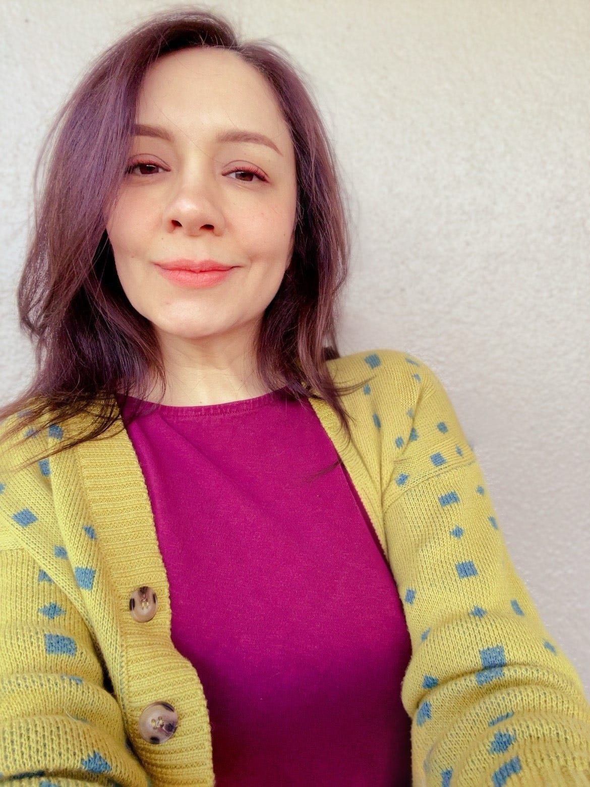
Boo Trundle: Could you please tell us a little about your history, how you got into visual art, your training, and how you came to be the busy professional illustrator you are today?
Adriana Quezada: I’m originally from Mexico City, and I studied graphic design, but then I took the route of doing illustration. I’ve been an illustrator for around fourteen years now. I’ve done many images for magazines and books, and also I’ve participated in many exhibitions. As a person who enjoys storytelling, for me it’s a big pleasure to work with Atticus Review.
BT: When you first sent us your work, I thought “Wow, these colors really pop.” They’re so bright, and animated. We thought your style would work well for our NFTs, because the images look so great in a digital format. What media do you use when you’re making the illustrations for Atticus Review?
AQ: For any work, printed, digital, or fine art, I always start with a sketch. Once I have the idea, and I’ve developed a concept that works for the project, I refine everything in the computer and add color. That’s one of the good parts of doing digital, is that you have this capability of editing things and tweaking the colors.
BT: Would you say that being from Mexico City, you have a certain sense of color? Is it part of your heritage, or your artistic influence?
AQ: I’ve been soaking in color all my life. Since I was little, I was naturally drawn to colors. That’s something that I came into the world with, a tendency toward colorful, vibrant things. And Mexico City is so full of color everywhere. I also watched a lot of TV when I was little, a lot of cartoons. I got some influence there, for sure.
BT: You got your start in Mexico City, but now you work in the United States?
AQ: Yes, I’ve been living here in the United States for 13 years. I’ve been so lucky to have created work for different places: Brazil, Colombia, Mexico, Italy, and here in the U.S. as well. Right now I’m based in San Diego.
BT: We’re going to spotlight your beautiful art today, but before we do, I had asked you to bring a few examples of influences.
AQ: To get into my influences, we have here Victor Gorka. He’s a Polish graphic designer. I enjoy how he uses very few images and very solid colors. He’s from the Polish poster movement.
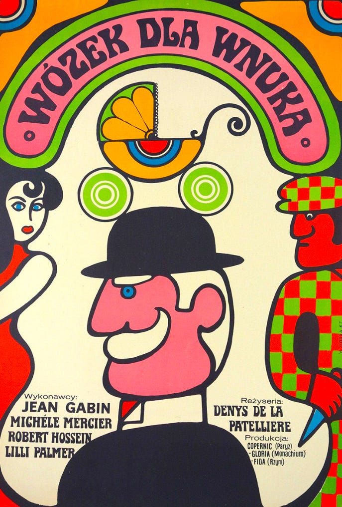
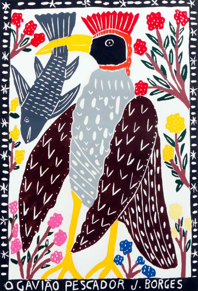
AQ: I love Gorka’s vibrancy, the simplicity. It’s very approachable, but it also has intention and a different way to present things. Also I have J. Borges here. He was from Brazil, and he made string literature, these little publications that he would hang from string. It’s a whole movement, string literature, picture books that are very accessible for all people. They have this folk art quality, only a few colors. So simple, but so charming at the same time. For me this is very exciting, the simplicity and the emotion.
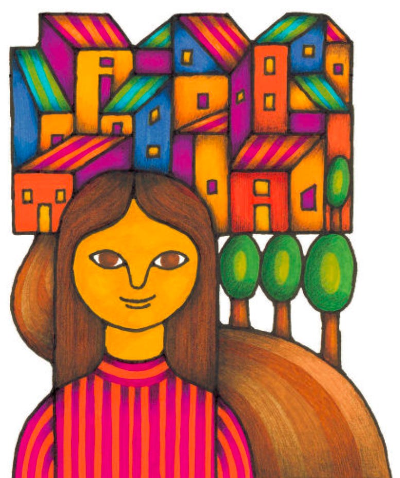
AQ: Next is Carlos Palleiro. He’s an illustrator from Uruguay, from Montevideo. These are images from my textbooks when I was little. For me, these are old friends, something that is so ingrained in my memory. Vibrancy, simplicity. Approachability as well. Big, bold lines. They are also a little surreal.
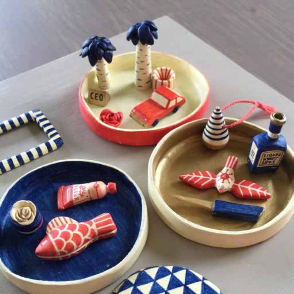
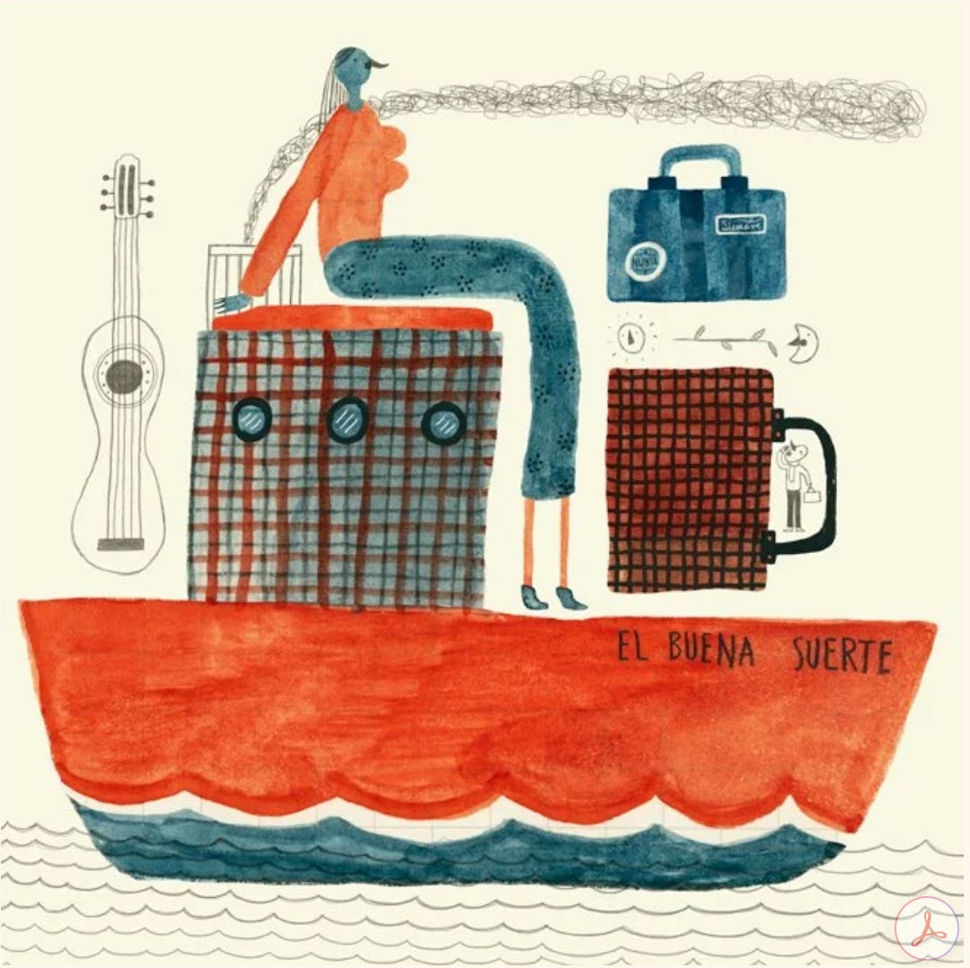
AQ: You are influenced at the end by your everyday life, your childhood, your family. All the color from Mexico, you can see it here in the kind of objects that you see there. You don’t see it every day everywhere, of course. That’s maybe a misconception that we have about Mexico. But you do find these objects, in mercados, or when you go to a park. My Latin American heritage is something that I love and enjoy a lot.
BT: You definitely bring it to the amazing illustrations that you’ve done for books and magazines.
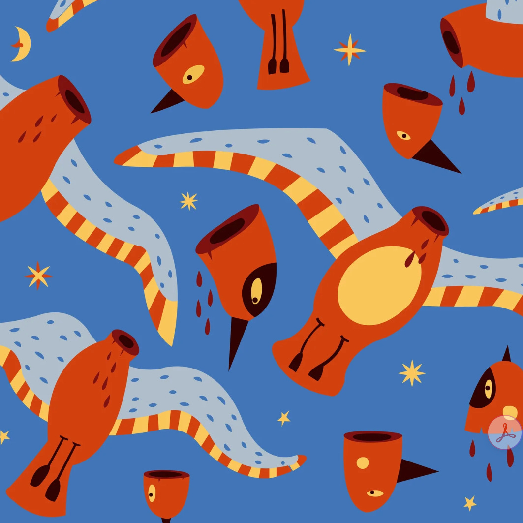
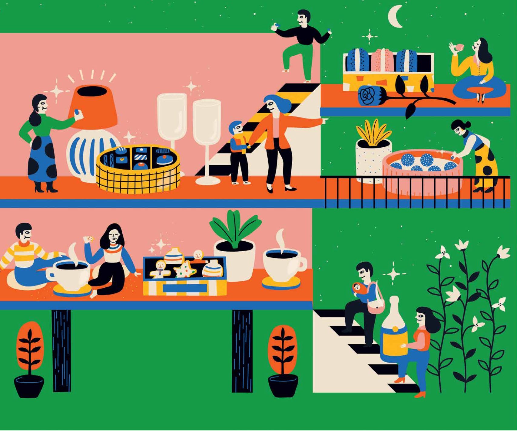
AQ: This is “Birds Without Heads,” about Renato Leduc, a Mexican author who didn’t care about prestige or that kind of thing. He broke rules and wrote things that were scandalous for the time and age in Mexico.
BT: That’s really a skill to make digital art that looks like a painting that has been reproduced. Maybe it’s because of the way you use color.
AQ: Working with color is one of the things I enjoy the most about my work.
BT: You keep it simple.
AQ: Yes, I try to keep it simple. Also, to keep my sanity as well, because when you are making an image, you can only say so much, right? It’s endless, the possibilities. You need to constrain yourself a little bit so you can really be creative.
David Olimpio: I was curious about how your inspiration goes, and if it’s been helpful for you to have a text to look at. Does it give you inspiration for your work? I like having an image when I’m writing. A visual image to start with.
AQ: A drawing is always going to say something. An illustration in particular is an image that is “company” for the text. It takes the text further, gives it depth, or complements it. Gives it something extra. It’s definitely useful when making an illustration to have a text; I wouldn’t even say useful. I would say it’s essential. As opposed to making a drawing.
DO: With a lot of your work as an illustrator, part of your role is to explain things in a visual way, and you’re starting with that premise. Do you have other work that comes right out of your brain? Where you’re just like . . . I gotta get this image down! You don’t want to explain anything. You want to express this emotion.
AQ: Yes, I draw every day. It’s a practice. I think it’s the same for writers? You write every day, at least a little bit. In my studio I have different spaces. In one space, I do ceramics. In one space, I have this drawing going. And in another place I maybe work on my computer or take meetings or that kind of thing. It’s essential to keep drawing and to have a drawing practice if you want to do this. I definitely draw everyday things that just came to my mind. They don’t always make sense, but I still enjoy them very much. They have this quality, a new way of looking at things, or just a little twist on how things are perceived normally.
BT: Or a big twist.
AQ: Or a big twist. Yes.
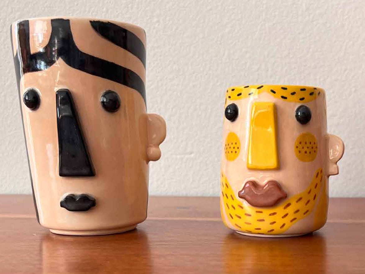
End Part 1. Check out next week’s newsletter to learn about the process Adriana uses to illustrate the NFTs for Atticus Review.
And if you want to see more of Adriana’s vibrant, color-saturated art (we know you do!) please go to her website.
REMINDER: We are open for submissions in all genres!
We're looking for work that comes out of "song." A particular song. A group of songs. An era. "Song" should be the launching point. We're looking for pieces that treat song not only as "music," but as a gateway to more... like, memory, confession, protest, or revelation.